Tuesday, 12 June 2018

Year 2 - Unit 69: Concept art for video games

Unit 69:
Concept art for video games
The stages that concept
art goes through to be
finished product.

How is concept art used now and what skills do you need?

Concept art is used in so many industries like film, tv, animation, comic books etc. But the most relevant to our industry is how it is used in the creation of video games. Generally concept art is used to influence the process of media products, it often is confused with visual development art or concept design however, they are not the same. The term 'concept art' has been used since the 1930s first by Disney, this term may have also come from the design of automotive for concept cars. Compared to the other industries it has been used in, the video game industry is easily the newest area it has featured in. As computing materials have grown in use and popularity concept artists not only need the skills of a fine artist but also know how to use certain graphic design programs, applications and software etc. to keep up with the standards of nowadays. Much like the games that are inspired by concept art they have different 'styles' and these can range anywhere from cell-shaded to photorealistic. Much like doctors there are concept artists who do everything (know as concept art generalists), but  there are also many who specialise in certain categories like character design, industrial design, environment design and creature design etc. As a concept artist they should know all the foundations of art like perspective, design, colour theory, anatomy and lighting as essentials.
Game Production Pipeline

Who is it useful for?

Concept art is useful for pretty much anyone in the games development. It is also useful to show how the work progressed to any interested parties. Generally concept art helps everyone involved to get an idea as to what they're working towards. This includes anyone from the artists to the programmers on the games project.

What stages is it used in?

The Art of  Naughty Dog
 book - merch based around
 concept art and finished art.
The game production pipeline consists of 3 main stages, pre-production (the exploration of ideas), production (approval of ideas by the publisher) and post-production (how the finished work is promoted to hype up the project). Obviously the two stages that seem the clearest are pre-production and the production as these are the stages that are the whole idea development and creation but also the concept art is used sometimes in post-production like on posters or even merchandise for the game. Ideas are refined in the first stage with the concept art being started, in the second stage the game art is designed based on a theme and the art can be anything from game menus and characters to art for promotion techniques. Also in the second stage programmers develop and build game logic based on the concept art, by the third stage all art should be refined to perfection and have progressed to its final form so that the game can be finished and approved for its launch.

Art and artists I like:

This is a piece of Eytan Zana's work from Uncharted 4
Generally it doesn't take much to impress me with artwork but it doesn't mean I like it, however I have managed to find 3 artists that I genuinely love with ranging abilities. The first is possibly the most impressive when it comes to detail and that is from a male artist called Eytan Zana  and he is currently working at Naughty Dog and is featured in the book mentioned above, he has worked on games like Uncharted 3 & 4 as well as The Last of Us. My favourite concept is the work displayed on the right, this is from when he worked on Uncharted 4 and this was for one of the first main environments when the brothers in the game travelled to Scotland. I like it because I really think it captures the beauty of Scotland, the style is obviously very photorealistic and has quite a dreary mood and also feeling lonely. The colour scheme of this art is pretty much white and brown which is the snow and the dying shrubbery contrasted with the grey of the skies.
His website is the following: www.ezdraws.com
This is the front cover of Telltale's
Sam & Max Season One game.
This is the back cover of
Telltale's Sam &Max
Season One game.
The second artist is Steve Purcell is an american cartoon artist who is the oldest of the three being 57 years of age, he created the duo Sam & Max and also done many covers and co-directed the film 'Brave'. I love his work on Sam & Max more than any of his other projects however because of how comical and original they are, it was a concept that he fully designed and refined alone right through from books to tv series and of course the video games. The thing I love about the game art to the right is how its so cartoon like and simple but also very complex at the same time. Its style is very comic book like and cel shaded, you can tell that it looks very edgy and dark. It's feel is that the environment that there in isn't very happy or somewhere you'd want to live and the main colour scheme is very sepia like using a lot of of brown and oranges except one of the characters which is white. I also really like the unnatural stances and body proportions which come with cartoon like games.
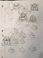

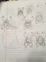
The third and final artist is Toby Fox but also Temmie Chang as their work together is incredible, Toby Fox created the game Undertale almost completely on his own from the music to the coding however although doing a very little amount of concept art Toby wasn't very good at it and enlisted the help of Temmie Chang. The drawings in the top left are the first sketches of a character called Alphys and Migosp, the image down next on the left is more work on Alphys and the start of a new character called Asgore, he is continues in the image to the left of that one. Toby Fox is 26 years old and Temmie is 25 years old. Temmie is credited within Undertale as the logo designer, overworld artist, shop artist, cutscene artist and title artist. The characters she is credited with as their conception artist is many with the majority being with Toby, however her cameo character  was fully her own.
Temmie's teaser art.
She is one of the main artists in Undertale despite being freelance. The image below is some teaser art by Temmie that she doodled for its making in the very front of the background on the right you can see the finished outline of the Alphys character and Asgore right at the back with his spear amongst other characters like Undyne. In the foreground it is the main character Frisk. I love Temmie's art below because of how its cel shaded and has a very dark feel and look but also a very happy one if you know the game well enough. Because this is only teaser art the colour scheme is very simple with just grey-scale themes and a hint of purple for the main character, this makes the characters we can't see mysterious and intriguing which is pretty obviously a good thing for a teaser. The finished product in the game is completely different to either of the concepts with it being pixel art (shown below). Temmie's art is also very happy and uplifting which is really nice to see (shown below with a birthday concept.
                                                                   
Temmie Chang's early concept art showing many of the
characters who are significant.

Alphys' finished character.


References:

https://en.wikipedia.org/wiki/Concept_art
http://ezdraws.blogspot.com/
http://conceptartworld.com/artists/eytan-zana/
https://en.wikipedia.org/wiki/Sam_%26_Max_Save_the_World#Episodes
http://www.thunderchunky.co.uk/articles/hitting-the-road-with-steve-purcell/
https://twitter.com/tobyfox/status/818212964994088960
http://undertale.wikia.com/wiki/Temmie_Chang


Friday, 8 June 2018

Year 2 - Unit 4 & 5: Evaluation

problems
good/bad points of the game
others feedback
conclusion - what would you take from this project to the next one

Unit 4 & 5: Evaluation

I never really encountered any major issues when creating my game other than Maya files going up majorly in size for no particular reason, I did however realise when it got to the last two weeks that I didn't have much time to actually start blueprinting the game. The best parts of my game I think are the models, they made the entire game seem so pretty and aesthetic and sort of managed to redeem it from the lack of enemies and substance. I guess that was the most obvious point that was bad but because of my level being a tutorial and its purpose simply being to introduce the rest of game calmly and smoothly. I feel like I still should've added in some sort of enemy that chased you to the end of the pier to make you jump in. The environment probably didn't look as good as it could've just because of my balcony models being untextured, however those, the fence and the main gates are 100 percent my favourite parts of the game just because of the detailing and the being accurate to the real place. I guess I also came across the problem of not knowing what to do when it came to the blueprinting as we were never really taught Unreal's method.
When people gave me feedback their favourite parts definitely varied with one person saying they most enjoyed the exploration of the game, the next said when they jumped into the water and the last player said that they enjoyed shooting the bottles the most which didn't really surprise me at all. They also enjoyed the story elements, the map and the models, the fact that people actually appreciated my models meant a lot since I spent so much time on them. People generally wanted me to add more textures, connect my level to Charlies and add an enemy in but when it came down to what feature they would add two out of the three players said that they would add sound to the game and the third would add a time limit to make it seem more suspenseful. Out of these 2 options I would definitely add the sound effects. No one didn't understand anything which is obviously really good except the text was hard to read at times since it was all in white. No one thought any of the abilities were over-powered or useless except from the fact that the guns ammo was impossible to see. The only other feedback I got was that it was a good tutorial level and that they wished it could've maybe guided the player more.
In conclusion, from this project I would take my knowledge of blueprinting and my knowledge of Maya to my next project in University.

Friday, 13 April 2018

Year 2 - Unit 67: 3D Animation - Task 1 & 2

Unit 67: 3D Animation


Task 1:

Summary of the Brief given by James:

Scenario 2

3D animation is probably best known in the wider world due to the creation of animated films. Now is your chance to create your own Pixar style short film. Using the Pixar’s short film “Luxo Jr.” as inspiration you will create a short film between 20 and 30 seconds using you own designed, modelled and rigged desk lamp character.


Task 1 – Due 13th April

You will generate ideas and specification documentation for a trailer/advert or cut-scene using 3D animation software which lasts between 20 and 30 seconds.  It must match one of the scenario briefs above and your own specifications.

You will:
·         Create your own brief based on the assignment scenario
·         Consider and interpret the brief generating and recording ideas
·         Develop the idea carrying out pre-production planning for that while compiling a comprehensive development log evidencing your creative work.

Development materials include storyboards, thumbnail sketches, mood board, legal and constraints. You can use concept art from Unit 69: Drawing Concept Art for Computer Games if relevant.

Justify your choice of final ideas for implementation.

Brief:
  • A written document outlining what you are going to do, the purpose of the project, materials needed and the timescale.
  • Serves as a guiding document throughout the course of the project.
  • Brings clarity and focus to the project.
  • Starting a project without one would be a bit like proceeding to build a house without a blueprint.
  • Designed to help avoid and highlight potential problems\issues
  • Based on your chosen scenario you are going to create a 20-30 second animation. How many frames will you need?(24fps * 30=?)
  • Overview of the concept and story.
  • Objectives and goals of the animation.
  • Schedule(Set yourself goals and break down the steps needed to complete the animation. Completed by?)
  • Target audience.
  • Available materials/required materials(What models and textures do you need?)
  • Overall style/look.
  • Brainstorming – Mindmap, moodboards, notes.
  • Sketches of characters, objects and backgrounds.
  • Pre-visualisation (concept drawings, storyboards).
  • Scripts
  • Souds
  • Software


Task 1 - My Brief

For this assignment I am going to start task 1 off by brainstorming my ideas, I will do this by first of all by getting all my initial ideas down on a mind map and then transferring those original ideas to mood-boards to flesh them out further. Once I'm sure on my ideas I will then finalise them in a storyboard and explain the scenes in further detail. The purpose of this task is to create the plan of my animation that will be done for task 2. Materials I will need include physical objects like a computer, scanner, paper, pencils, pens etc. and computing materials that will exist on the computer like Maya, iMovie (or another video editing application) and access to the internet etc. My aim will be to create the basic mind map, come up with the actual idea concept and make this brief over the two weeks of Easter (26th March 2018 -  6th April 2018). Within the first week back after this and the last week with this project (9th - 13th April 2018) I will have aimed to have created my drawings, finish my storyboard and create a moodboard.
If I was to create an animation that lasted 30 seconds and averaged at 24 fps as standard I could need to create a total of 720 frames. My goals of this animation is mainly to expand my knowledge of Maya and animation but also to enjoy creating something inspired my favourite animals and love for them. My target audience for the animation would actually be for anyone of any age but mainly younger audiences of any gender. I will need to create only three models; two dogs and a tennis ball. The textures needed with either be fur or a solid colour to make it appear more cartoon like but I might create them myself in Photoshop to get the full personal effect. The background of this animation is noted further in my moodboard linked below. Scripting will only need to be very simple as it will all be animated by hand in Maya and sounds within the game are explained within my moodboard. Originally I decided to just model some German Shepherds (as shown on the mind-map) but I later decided when it came to drawing them I preferred to have two totally different breeds hence the change.

Mindmap of concept:

https://drive.google.com/open?id=1um9Qdq7YLl0zsr7KUgCBEkUZ1kcg_T-H

Storyboard:

https://drive.google.com/open?id=114j9UJm6IzPSTLNHjmTA_aUDJQ1P82NP

Drawings/Concept art (Tennis Ball - left, Lady (mum) - middle and Scamp - right) :


https://drive.google.com/open?id=1G0sZQ78zf3ISuRhGNiTB7hKDvE--KMxi

Mood board:


Task 2:

Animation Link (File and video): https://drive.google.com/open?id=16yAqYFssHd5Okb7Lw8d365DP4OgVm5XF

First 2 dog models rigged and modelled
Lamp used in the end fully rigged and
modelled
I definitely gave myself way too much work right from the start but I can usually get everything under control in time, however on this occasion I definitely have not been able to do such. I spent over 75% of my time on either modelling or rigging my models. Once I finished these two things I only had a few days to finish the whole animation, but as I started I came across many issues that seemed impossible to resolve with the way my models were rigged. I realised I was in over my head and decided that I should probably make my life easier and go for a simpler concept. I resorted to my current animation idea of the dog passing the ball over to a lamp to play with instead, this would be much simpler to animate and control. I found a fully rigged and modelled lamp off of a website called 'Turbo Squid,' and used instead of creating my own model again and rigging it. The tools I used consisted of scale, rotate and move for the general animation part but when creating the dogs I used the different polygons to shape them and also the image below. When rigging I used the create joint and ik handle tools to rig and the camera tools to move a camera and create more depth to the finished product.
An image used to create the mum
Cocker Spaniel proportions.
Overall, I think its pretty clear my idea didn't work as planned and I'm not as pleased with it as I could be but the finished product works well enough for me to submit it. It does fit the brief of the assignment and has a wide range of techniques used showing a range of abilities so it definitely does me some justice even though I know I could've done better. I feel like although some bits of the lamp animation are a little out of time the actually look of the models used are intensely detailed and probably the animations best assets, especially the dogs which have all the joints and proportions almost perfect. It is pretty clear however that this is the reason for my animation not being a clean as it could've been. I still tried to keep with the idea of something playing with a tennis ball like in my plan so it didn't veer off target completely at the the end product. I've already been over this but my time management has been pretty awful overall and I am fully aware that it was my own fault even if helped slightly by the rigging issues within Maya. The lamp was something that was always in the back of my mind because of the brief we were given so it just made sense to apply my animation more literally to the brief with the lamp.


Tuesday, 20 March 2018

Year 2 - Unit 71: Object Oriented design for computer games - Task 2


Unit 71: Object Orientated design for computer games - Task 2


Concepts and principles: simplified understanding; reusability; maintenance; efficiency; real-world modelling; collaboration and sharing; communication; quality assurance


Game objects: sprites; characters; weapons; rooms; walls; scenery; instances; rewards, eg bonuses, power-ups


Object properties: colour; size; speed; movement; sounds; health; lives

Actions and events: mouse and keyboard events; create; destroy; collision; timers; scoring

Inheritance: parent; child; inherited behaviours and properties; overriding events


Concepts and principles:

In Game Maker its a lot easier to understand the whole game engine rather than just small singular features. Anything from character art to coding is pretty simple to navigate around, this is possibly because of how clear and easy the whole engine is just at a look. Everything is right in front of you whereas with Unreal you have to literally search for all the different possible features. Unreal has so many features that to be able to learn everything you would have to put so many months of exploring the engine in. Although its not a bad thing, it definitely makes it harder to find what you need but then again maybe Game Maker doesn't have enough or as many good features.

Unreal Engine Layout
Generally you can use both of these engines over and over again and still come up with a whole new idea or concept every single time. With Game Maker though you can get a little tired of not having so much freedom as you do in Unreal. Reusing Unreal is such an easy and exciting thing to do simply because of how many possibilities it has to offer, I would much rather spend my time reusing Unreal than GameMaker.

Game Maker Engine Layout
The maintenance that these two engines have is pretty different, with GameMaker if the code has an error the system comes up with a window that says what part or line of the code is failing drastically. With Unreal they have a thing called Map Check Errors which alerts you of potential problems, this informs you of any Errors (critical problems that have a possibility of causing some sort of execution failure) which should be fixed before carrying on, Lighting issues (any problems with how the lighting performs), Warnings (these aren't as important as errors but can cause your game to under perform) these should be addressed but aren't the end of the world, Actor issues (there are many different types of these but they are based upon the character/player), Camera issues (if the camera is not up to spec and should be changed to actually be able to see whats going on efficiently), Foliage issues (if any trees or bushes etc. have something wrong with how look or work), Landscape issues (shows what may be wrong with the landscape e.g. overlapping) and Sound issues (any sound may be affected by issues and should be fixed if you want a fully immersive game). The two engines are different simply because of how specific they are about the errors they encounter, Unreal tells you what type of issue it is but Game Maker tells you exactly where it is.

The efficiency of these engines is pretty different as one is a lot quicker, I think personally, and the other definitely takes more time. Game Maker is quite an efficient because it does what it says and quickly whereas Unreal does do what it says it can, but because it has so many more aspects that can be changed to will it takes longer to complete.

The real-world modelling for both of these engines varies largely because of how many features they have, Game Maker is pretty simple to code, especially things like collision. unreal is a little more difficult because each part of the game has different codes that all need to be edited apposed to how with Game Maker most of the time you just have to drag and drop code or check a box.

Collaborating and sharing projects is pretty difficult with both engines but it is only directly possible with Unreal, although you can obviously copy and transfer your game file in both you can only do it without that effort of updating every time you want to by such a long winded way. Unreal comes with to integrated ways that make it possible for people to work together using a thing called Version control. It allows multiple people to share different assets and code with each other, it also has backup and any history of the changes made so the file can be reverted if needs be.

The communication between the different parts and aspects of the engines are pretty similar, however Unreal has a few more steps because of how it has more routines to go through. Game Maker pretty much just relays information between two main scripts and a few smaller checks, whereas Unreal relays information between so many codes and checks that its constantly busy.

Using quality assurance with these two engines is pretty easy but Unreal can be a little more challenging simply because fixing any problem isn't quite as easy as Game Maker but making a game in Unreal does give the game a higher quality feel. Finding any issues within Game Maker is a lot easier than Unreal because there's a lot less to go wrong on/with.


Game Objects:

Sprites and characters are pretty similar to create as are weapons, rooms, walls and scenery within Game Maker They all follow the same creation with pixel art or imported images. Characters, walls and weapons are all created as sprites and then added as objects which are then later coded into the game as they should be. Rewards and instances are more code than anything else and often need collision detection to work fully in the game. Creating rooms in Game Maker is a bit different, you create rooms not as a sprite like the others but as a room, you can do this from scratch with pixel art or just import an image. Just because Game Maker is all 2D doesn't necessarily mean it can't be animated, this is in the same sprite creation and you just add fresh frames and bend the image to your will. In Unreal characters, sprites, weapons, rooms, walls, instances and rewards are created as a 3D model mainly in Maya and are then transferred to Unreal for coding. The Scenery is the same and like the others it can be imported from the communities library. So Game Maker has a sprite and object builder built in whereas Unreal does not. Rewards in both engines are created as objects and then coded to give a bonus, power-up or some other sort of advantage. When creating a wall sprite in Game Maker you need to add it as an object and make sure you then tick the solid and uses physics box, this makes the wall collision proof so you can't go through it. For Unreal its a similar idea but instead of ticking boxes you program it in a way.

Object Properties:

The colour of objects within Game Maker is not that changeable as the colours can only be solid and on a basic colour wheel, if something wants to change colour halfway through a game it has to be part of a new frame animation. In Unreal there are so many different ideas for colour, it can just be a singular and generic colour or could be a whole number of textures like wood or concrete, all of these can be added only within the modelling software like Maya.

Changing position and size of object in
Unreal
To change the size of something within Game Maker you need to scale the image in the sprite creator from the transform tab and up the scale percentage up or down depending on what you wish it to look like. In Unreal to change the size of something you can do it in the engine rather than having to go into the 3D modelling software using the scale tool.

Speed in Unreal
In Game Maker if you wish to change the speed anything is going at you just have to go into the proper events and make a direction combine with a key and then add the move action and change the move speed from the pop up menu. In Unreal if you go to the character movement code you can change the max walk speed and then increase or decrease to your hearts content.

Sound in Unreal
Adding sound in GameMaker is pretty simple as all you have to do is link a sound action to a event, if its background music then it can be added just as a level starts or if its a shooting sound it can be added to that. In Unreal you can set sound as an event starts as well and change the volume as well. The coding for sound in Game Maker is definitely 100 times easier as its all available to build on rather than starting from scratch.

In the following link from the last assignment you can see how to create a health bar and lives in Unreal and Game Maker in the 2nd Example and the movement in the 3rd Example :
Image result for create object in unreal
Creating an object in Unreal
https://sarahsgamesdesign.blogspot.co.uk/2018/03/year-2-unit-71-object-oriented-design.html


Actions and Events:

Mouse and keyboard events in Game Maker and Unreal are both pretty similar and simple, for Game Maker you add whatever button or key pressed as an event and then add an action to that. For Unreal you do the same within the characters code. (Similar to the above movement. Creating something in Game Maker is really easy as you just use an event and then the create instance action, once that's done you can then add the new objects events. In Unreal you use the create new object action in a certain objects event when something happens. again these two engines have a very similar method of doing this.
Destroying an actor in Unreal
Cool-down timer in Unreal
To destroy something in Game Maker you link the destroy action to an event like a collision and in Unreal you also do the same within a certain model/objects event and select the destroy ___ action. Collision is explained further in the Game Objects paragraph above, in both of them there's an event called collision that you can use to make an action tagged to.
Setting a score in Unreal
Timers in Game Maker can be added within the games controller object as an events action as they are in Unreal, you can change how long they are on for and how doing certain things may affect the time limit, maybe collecting a timer increases how long you have and maybe getting hit decreases. These would be under a new event but would still relate to that original timer at some point. Scoring in Game Maker is done by yet again another event action it is explained further in this video: https://youtu.be/jkblYOI_Dqc?t=5m27s
In the whole video I explain how to do almost everything I've spoken about above in Game Maker so that video includes all my examples for Game Maker rather than just screenshots.


Inheritance:

Parent setting in Game Maker
Unreal parent setting for a gun
The parent object has the coding that is used for the child, it works the same in Game Maker and Unreal as one object is the parent, if you change this object in any way the child/children are also changed once they are recognised as its child. This just makes the whole enemy copying easier with just using inherited behaviours and properties.


References:
https://docs.unrealengine.com/en-us/Shared/Editor/MapErrors
https://docs.unrealengine.com/en-us/Engine/Basics/SourceControl


Tuesday, 6 March 2018

Year 2 - Unit 71: Object Oriented design for computer games - Task 1


Unit 71: Object Orientated design for computer games - Task 1

Screenshots of how I created the gml
  •           How is it used
  •       Compared to this year
Attack, health bar, move
How is oo design used
More examples plus detail
How do we move in gamemaker vs unreal
3 examples
Paragraph of making a game in unreal vs gamemaker

Opinion paragraph at end

Example 1 - How to attack:

Code to create the ammo
Code to make the ammo move 
Code to make the enemy die if it
is hit by the ammo
Code to destroy the ammo if it
misses
In GameMaker to code a character to attack it's pretty simple as all you need to do is group a certain keyboard key to the creation of another object, this specific code is added to the object that releases the ammo as it were (the playable character in this case). Now once I press the space bar it just creates the ammo so I needed to make it move straight up towards the enemies that you are shooting at. From a pop up menu you can choose which way it moves and at what speed, this part of the coding will be within the ammo's events. After that is done we need to make it so that the enemy either disappears or loses health when it is hit by the ammo, this part would be located within the enemies events and actions and would be classed as collision detection.  However, I also needed to code it so that when the ammo missed the enemy it would destroy the ammo rather than letting them all gather. This small bit of coding is located within the ammo's events.


Attack Animation: https://youtu.be/GQlqwFiIiu0
In Unreal to make a character attack something its much of a longer process as you not only need to animate the action but also make it so that the action (for melee attacks) does damage to the enemy. Although I haven't included this in my game just yet I do plan to and this is how I will do it in this specific game engine.
Attack Damage: https://youtu.be/LjDsPr4ujDE
All of the coding for the attack animation will be found within the animation blueprints, Unreal has many animations that you can use so this part of the coding shouldn't be too difficult. Using a collision based overlap system we can code the character and the enemies so that when the melee weapon overlaps the enemy it does some damage. To make this accurate you will need to tell the engine the points in which it would actually overlap. (Shown at around the 2 minute mark of the video linked to the left). To make so that you only do damage to the enemy when you swing the weapon you will need to make sure that the weapons variable is used when swung to check if it actually is in contact/overlapping with the enemy.


Example 2 - How to create a working health bar:

Having the characters health full
Drawing the health bar
In GameMaker to create a health bar that is actually functioning we first need to make sure that the enemy/characters health starts on full, this will need to be in an invisible object's code and will start as soon as the game itself does. The second part of the health bar creation is to actually draw the health bar under the character. In the enemies code when it gets hit its life will reduce.


Creating the Healthbar
Health bar coding
In Unreal the creation of the health bar comes before the actual coding of the decrease or increase of the health. This piece of code basically just states when or not the character should regenerate  health or lose it. This code is found within the third person character under a health bar function.


Example 3 - Moving the Characters:

Move right
Move left
In GameMaker to make the character move you assign a movement to a certain key on the keyboard. Once that is set you can then change the speed to however high or low you wish just like when I did it for the ammo going towards the enemies.


In Unreal to program the character to do simple movements you don't actually have to do anything because it already programmed for you inside of the characters movement input. This makes it a lot easier to get straight into the other aspects. However, if you wish to do so you could go deeper into the specifics as it can be edited.


Conclusion:

In conclusion I feel as though there are so many differences between these two engines that I love them both for their own separate reasons. The reasons I love GameMaker are many, the first being how easy it is to code as a beginner and how you can expand from doing a more visual programming skill to an actual language whilst still using the same engine. I also love how simplistic it is and how you can create the sprites within the engine. But on the other hand I like Unreal for its endless possibilities of the graphics and how you can model such a complex and detailed model and use it within a game. Also the programming is slightly more complex than GameMaker's which is harder to get to grips with but gives you so many more possibilities of what you can do now and in the future of the game you create.


Screenshots used in higher quality are located within this folder:
https://drive.google.com/open?id=1C-bb9A6uXc8Czb2MtYJ1FnHMPyeiIgen


Tuesday, 30 January 2018

Year 2 - Unit 6: Critical Approaches to Creative Media Products

Unit 6: Critical Approaches to Creative Media Products


Task 1:


Quantitative:
A review from IMDb


Audience ratings - An audience rating is a figure based on a sample of statistics which shows how many people like or dislike something, this could be anything from a tv show to a game but in this case it is based off peoples opinions on a film. Big Trouble in Little China has had an overall rating of 7.3/10 on IMDb and 6.9/10 on Rotten Tomatoes. On Rotten Tomatoes there is a total of only 38 reviews counted, 31 of those reviews were positive and 7 were negative. On IMDb they have collected 345 user reviews and 190 from film critics so far. However, without counting all of the reviews I can't get a specific number of positive or negative reviews. The average rating on IMDb is 7/10 with a rating of 8/10 only 2% behind, it was rated generally a little higher by men than it is by women with only 7,328 women voting at an average of 7.1 and a staggering 76,648 men voting with a little higher average of 7.3. It is surprisingly rated the highest by people who are under the age of 18, this number is a 7.5/10. As this is the highest rating on average this doesn't seem to bode that amazingly well for the films reputation, however this  overall review and rating still makes the film better than average and even quite positive. People between the ages of 18 and 29 rated the film an average of 7.2/10, there is rating of 7.4 that is the average from 30 to 44 year olds. The lowest review was surprisingly from those of the age 45 and upwards as a 7.1/10, this is quite shocking as this category of people is the films target audience.

Qualitative:

What a focus group may look like
Focus Groups - It is a research technique used by a company as a marketing strategy, the use of this method and all of the others definitely gives these companies the best possible answers to any of their marketing questions. These groups are most likely filled with a small amount of people, generally this number can range anywhere between 6 and 12. They are probably from within a target audience that is specific to the product or service in hand. The group participate in a planned discussion that is supposed to draw out its audiences perceptions about a certain topic or area of interest. It should be be a non-threatening and receptive environment so that the subjects feel comfortable enough to share their true thoughts and feelings. This research technique helps to see alternative ways of gaining information from consumers without using a simple and non-engaging survey. They are flexible and gain the advantage on others who have the ability to talk to their customers. The people who are taking part may vary in things like gender, sexuality, race, religion and backgrounds etc but the topic is fully constant. After scouring the internet to try and find any sort of focus group research relating to Big Trouble in Little China I came up with nothing that appears to be of use. I am guessing this is probably because the majority of the films audience is over the age of 30 and the concept of discussing this film seems too outdated to be worth the effort.

Possible answers from a questionnaire
Questionnaires - These consist of a series of questions which are used to gather information from the people who take part. It was invented in 1838 by the Statistical Society of London. Its main advantage is that it is cheap to set up and how it does not require as much effort as verbal surveys. The possible answers that are given are most likely going to be from a multiple choice selection, this makes the given data much easier to compile and average out. However, these set choices as answers can frustrate some users due to how they cannot fully express their opinion if it is not fully there. Unless the questionnaires are done in many different formats and languages some subjects may not be able to read the questions on their own. This research method can be very useful if you know what specific factors you want to explore by the fact that you are able to make multiple people answer the same question and get similar answers. A questionnaire can ask a large range of questions varying from things as simple as what age, gender or ethnicity someone is to what genre of games, films and music they like. This means that a company could use this to explore their target audience, so for the film Big Trouble in Little China the writers could've figure out what language they should use based on the age and gender of the people interested in the film. This could've made the film appropriate for larger or more specified audiences, I'm guessing because of how old the film is I cannot find any questionnaires based on the film.

What an interview my look like
Face-to-face Interviews - This is a data collection method in which an interviewer directly communicates with the subject with a specific set of questions or from free will. This choice can take a long time to complete but allows the interviewer to acquire the same information from a questionnaire but much more in depth, not only this but it also allows the recognition of body and facial language to be taken in and considered. The response rate is generally increased and the feedback can be a lot more reliable and trustworthy. If someone writes down on a questionnaire that they are 30 year old male and they are lying you can't see that clearly but if they were to come to an interview you could generally take a guess as to whether they are lying or not. The fact that these interviews require staff to perform them is probably the biggest disadvantage to this method because that can cost an awful lot of money to gain the right kind of interviewers. The interviewer may not know what to note down which could lead to a lot of wasted time if nothing becomes of that collected information. This could be because the interviewer has some biased opinions and would rather not have their subjects opinion noted. These interviews could however help to find out more information for a companies business none the less. Finding out what a person likes in a more intimate setting often makes the interviewee more comfortable to give their full opinion. This can help the company cater their considered product more intriguing to larger audiences. Like all of the above their was no such interview of Big Trouble in Little China's audience, it was more of the actors and other people who took part in the movies creation.

Audience Classification:

Socio-economic - Theses are groupings that are broken down into different sections and divided from A to E. Band A is pretty obviously the higher earning group, they are classed as professionals like doctors. Band B has the roles like teachers and graphic designers, band C has to further categories, 1 and 2. C1 or White Collar includes occupations like junior managers and nurses, C2 or Blue Collar has semi manual workers such as plumbers and builders. Second from the lowest band is clearly D, you will find a manner of unskilled and semi-skilled manual workers. Band E has those who cannot or don't support themselves in a financial way, these can be anything from a pensioner to a student. There is the possibility of their being a seventh category but it is currently being debated. These different classes are used by companies to determine which group would be their most suitable target audience.

Difference between demographics and psych-graphics
Psycho-graphics - These can be a buyers habits, values or even hobbies, psycho-graphics are different from demographics because they explain why a consumer buys something rather than who the actual consumer is. Understanding an audiences psycho-graphics is the key to effectively reaching them. Say we were trying to create a film that would then become a game, to be successful in both ideas we would need to compare who would buy the game versus the film. The ideal situation would be to create a film and game catering to the same specific audience based on why they would want it so they would buy both the film and the game. The sort of things to look out for and link psycho-graphics wise would be what genre they like. One of the most common game and film genres is action, so if you created an action film and game its audiences would be in the masses, not only this but if someone enjoys an action game with a lot of violence they would probably enjoy a film with the same characteristics and vice versa. Big Trouble in Little China was only ever looking for its singular audience, the most likely reason that people would be drawn to it is probably because its an american comedy rather than its martial arts side.

Mainstream - Mainstream audiences are pretty much audiences where a lot of people like the same popular product. Companies will pretty much always cater to this group of people simply because its easier. Easy money, easy advertising and easy on time. Big Trouble in Little China is actually more mainstream than would be originally thought, as I stated above it is a comedy which is one the best genres for a company to have chosen due to its popularity. If we were thinking in music terms this would easily be the 'pop' genre.
If the different groups of popularity were like genres of music

Alternative - Alternatives audience are quite a lot less common than mainstream audiences, this group will generally have its own ideas of what they like and although they are smaller than mainstream ideas they still are pretty popular opinions. Big Trouble in Little China has its martial arts factor as its alternative audience, loved by many, just not as much as comedy. If we were thinking in music terms this audience would be the type of people that like rock,metal, indie or rap etc.

Niche - Unsurprisingly this audience hold the smallest amount of followers, these types of consumers very rarely share the opinion of anyone they meet. Big Trouble in Little China has a good thing going that it doesn't use any of these factors. The creators and companies tend to steer clear of these audiences to get the most out of their work.If we were thinking in music terms again these people would be fans of more abnormal genres like symphonic metal etc.

Applied:

Correlation - The correlation between Quantitative research and Qualitative research is that they both are used to find out information about an audiences wants and needs. The numerical information and the non-numerical information both have very similar research topics, they both want to find out the most information to help their product or service sell well.

How successful were my methods? - My methods I would say were fairly good, I researched as deeply as I could into the ideas and I feel as though I may have gone further into detail as others. However, I could definitely have done my own research which could've included my friends and family to get my own personal and possibly more accurate results. However, IMDb and Rotten Tomatoes seemed pretty amazing, detailed and accurate sources to use.


Task 2:

Selection of content:

The most known quote from the film
Screenplay - The screenplay of the film was specified like the rest of its content to cater to its target audience. The script is written so that the martial arts side would be kept true to so the alternative audience, that enjoy that aspect, keep their faith in it. But it has also elements of the comedic aspect to appeal to the mainstream audience, this includes the gags and long lasting ironic quotes as shown to the right. The main character is a masculine male, according to the statistics shown in task 1 the film was rated more and also higher by men. Because the film is led by such a strong male character it's stereo-typically not that surprising that the majority of its audience is male. The masculinity of Jack Burton was written amazing well by the script writers to give such a conceited and egotistical main role.

What the visuals in Big Trouble in Little China mainly consist of 
Visuals - What we see is very typical of late 80's movie visuals with the lighting being very dark and moody, this style caters itself to the audience of its time. To make its audience feel more immersed the creators of the film used stereo-typical Chinese people and surroundings, this helps to really bring out the classic martial arts feel. The creators used a handsome Jack Burton probably because this should have helped the movie appeal more to women than most martial art films do, however I did notice that there were no sexualities in the film other than straight and this is possibly because of the times. You see Jack in his truck at the very start you can see Jack in his large truck, this could be a metaphor of masculinity with the size of it. We see the electricity shown by the black magic with the static blue lights, this shows its audience that its true to its magical roots. The roads shown at the beginning are quite narrow and long with fields surrounding them, this attracts the audience that don't specifically like the martial arts genre because its not started in Chinatown. We see the rain pouring down on Jacks windscreen this helps to back up the lightning with the dark and moody lighting. The Chinese market sets the scene for the rest of film for the karate loving part of the audience, we see a lot food in the market like chicken and duck which helps the people who aren't that big on the cultural history think of the classic food that they may have ordered themselves. The betting and drinking that we see shows the masculinity of Jack Burton and his friends, this targets the male audience with the idea of them comparing to him. All of the tourists in Egg Shen's bus are white except one female, this could be their way of achieving more of a racial equality so it seems more interesting to the masses. We can see all of the guns, bandannas and black/red/ karate belts, these features are very key to any martial arts film and give the film a slightly more genuine appeal to those who are fans of it. A Chinese standoff between the gangs is shown to gather the fans of action films and the Chinese black magic is featured with smoke and lighting for the appeal of the true Chinese setting.

Sound - The sound in the film starts of very solemn with a low mood as the soundtrack, this gives its audience a variation of music so they don't bored and this certain scene needs the music to create the right ambience. We then go into some light rock when we see Jack for the first time, again this is probably the masculine side of the audience coming through with our introduction to his character.
What the typical view of Chinatown is throughout the film

Sequences - At the beginning we start with a look into the future where Black Magic is being questioned, this gives the audience a first look into what they are getting into so they don't feel like they're watching just any film. We then go back to the present day with Jack Burton again seeming very masculine driving his truck and eating fast food, once he arrives in Chinatown we see him surrounded by the Chinese culture and people which brings the audience to its main attraction. The middle of the film is filled with the action and chase of the film, this appeals to its audience because many of the viewers like action films and in this is the martial arts seeps through. At the end we have a happy scene with a little bit of romance to appeal to the romantic audience, however the masculinity comes back when Jack goes back on his own.

Construction of content:

Colours - All of the colours that have been used are generally very dark, this is linked back to the visuals of the 80's film. The main colours that are used are red which is generally thought of as the main colour for China, we then have some blue which links back to the electricity so that the audience who enjoy magical films make the connection and yellow which again is a very Chinese like colour. The colours used are not particularly very vibrant or pigmented and are very dull, however this is probably because of the equipment and style of the times, this should apply to all of the audience.
The title/intro font for Big Trouble in Little China

Fonts - The font at the beginning and the end with the credits are a very basic white font with 3D lettering. The font of the title 'Big Trouble in Little China,' is in a bold, red and Chinese takeaway font, this may be tacky but is pretty stereotypical so even simply by the title we can already tell that it will be based in Chinatown. In the middle of this we can see the same font but with Chinese lettering.


Codes and Conventions:

Jack always seems to be the one front, this could be
a show of his masculinity in protecting.
Symbolic (Characters actions) - We can see Egg Shen backing up Jack right from the start so we already begin to like him and see that not everything we see is as it seems. A possible metaphor could be how Jack crosses a large bridge in his truck, this could be to show how he became a different person. One way we can see Jack foreshadowing what will happen is when he says 'a man'd have to be some kind of fool to think we're all alone in this universe,' this would please the part of the audience that like the magical part of the film as they now know that something like that may happen or even be a key feature. The friends that Jack makes are different genders and races which again helps the creators connect to further cultures and gives a symbolism of anyone being friends with each other. There are so many cultures that are portrayed within the film, the majority of them come from the same ethnic group but they all share different views. This makes its audience believe how the Chinese cultures work.

Technical (Camera Techniques and Shots) - The only specific thing that the camera ever does is point to the main person speaking, however the majority of the time it points at Jack even when he isn't the one speaking.

Modes of Address:

1st and 3rd Person - I don't believe that the actors ever address themselves or each other in third person. All the scenes are referred to in first person in speaking and third person with the camera.

Egg Shen performing magic in his interview with his
attorney
Formal - The only real formality in the film is right at the beginning when Egg Shen's attorney interviews him about the events that happened.  This makes us as the audience see how strange this concept of formality is with this culture as they're so used to just saying what they think (at least that is what we are led to be believe from the creators).

Informal (Slang, Expletives etc.) - Jack is very informal, he is very loud, rude and makes a lot of jokes, at no point is he formal towards anyone. This brings out his cocky masculine side and appeals to the male audience. Jack also swears a lot, these expletives are mainly used by him and no one else, this appears to have the same appeal as the rest of his informality.


References:

https://www.thebalance.com/what-is-a-market-research-focus-group-2296907
http://www.imdb.com/title/tt0090728/ratings?ref_=tt_ql_op_4
https://en.wikipedia.org/wiki/Questionnaire
http://www.spinter.lt/site/en/vidinis/vidmenu/face-to-face-interview
https://blog.hubspot.com/insiders/marketing-psychographics
http://smallbusiness.chron.com/mainstream-vs-alternative-media-21113.html
https://prezi.com/ynsi5tngnrvz/classification-of-audience/
https://www.slideshare.net/952501/how-media-producers-define-their-target-audience-19065483